An Aromatic Beginning
Bonded by their deep love for cooking, passionate South Indian homemakers
Kavitha and Kalaivani embarked on a journey to share the heirloom flavours of
South India with the world (The US in particular and in India too).
Bonded by their deep love for cooking, passionate South Indian homemakers
Kavitha and Kalaivani embarked on a journey to share the heirloom flavours of
South India with the world (The US in particular and in India too).
Naming Origins
Hand Mill Saga - A coined, lyrical name that narrates a flavourful story.
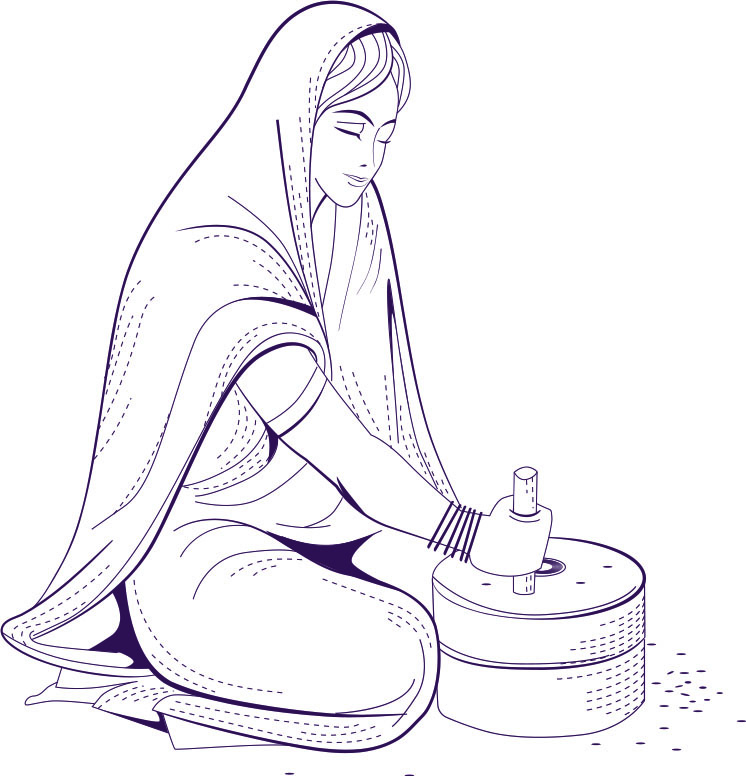
The words 'Hand Mill' were blatantly inspired/borrowed from the brand’s commitment to using the traditional milling method. Hand grinding grains and spices was and is still a staple of traditional South Indian kitchens. A special labour of love that enhances the authenticity, taste and aroma of dishes.
The word 'Saga' as a suffix was chosen to honour the richly marinated stories behind the heirloom recipes and flavours passed down as a legacy.

We crafted a minimalistic logo that seamlessly reflects the brand’s essence. By
featuring a meaningful visual of spoons arranged in a circle, we symbolised both the
art of milling and the harmony of flavours.
The typography balances tradition with Indian-inspired fonts and the colours have
a vibrant global character.

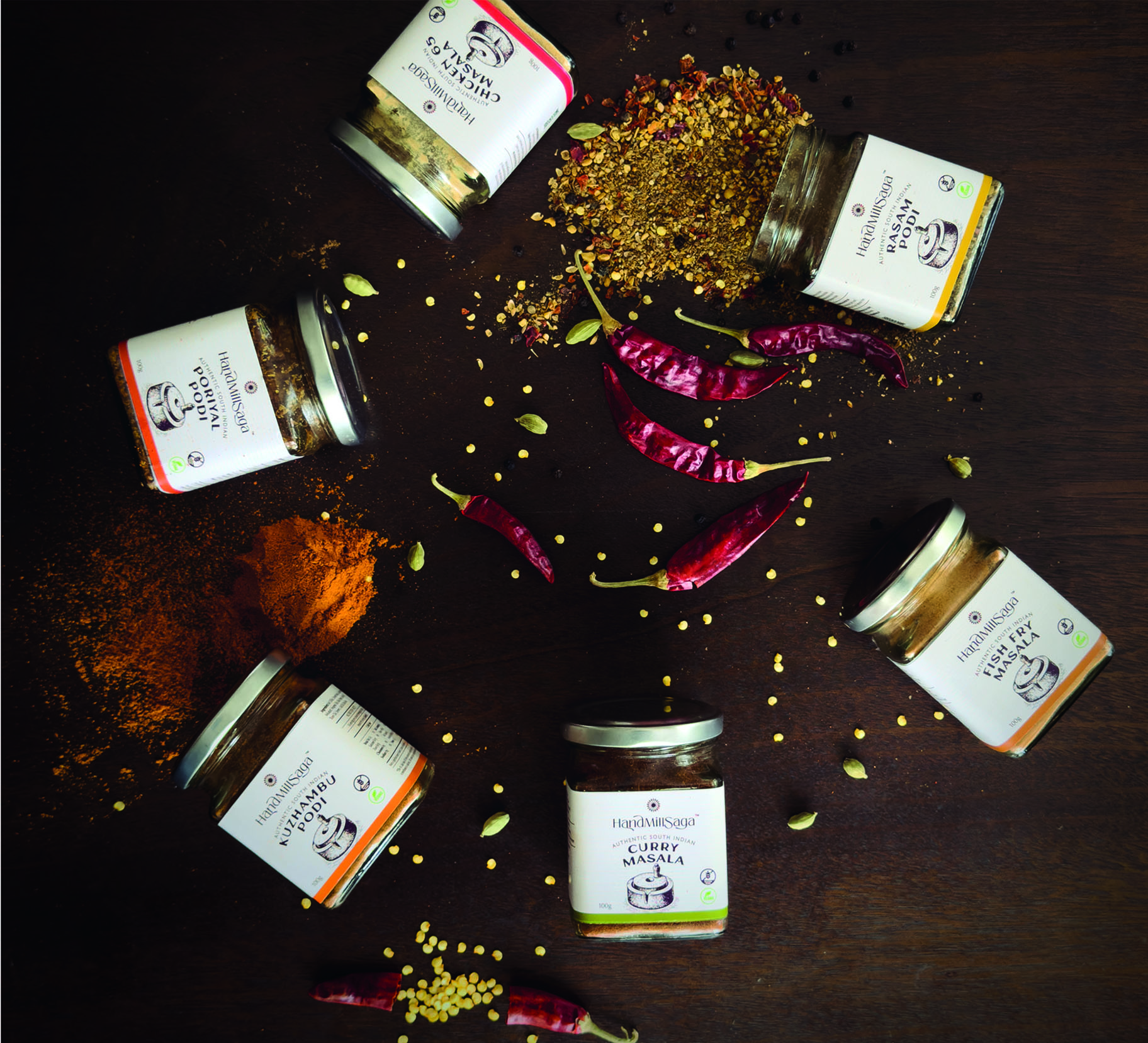
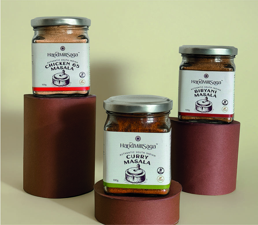
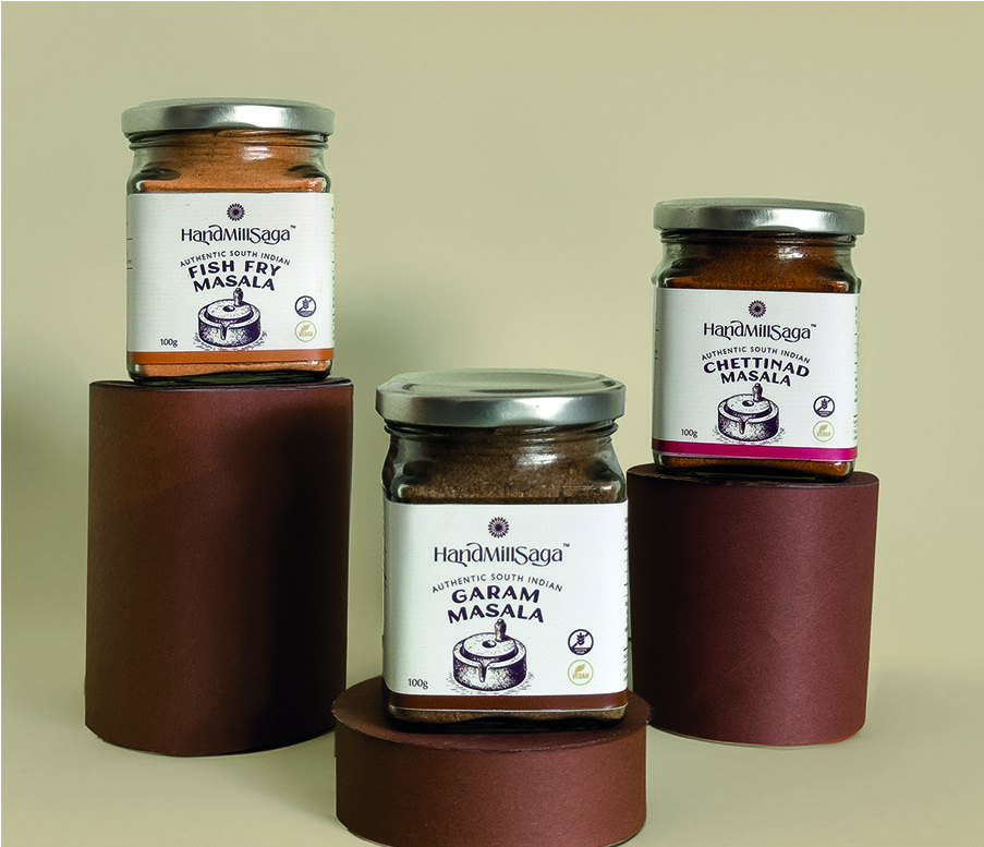
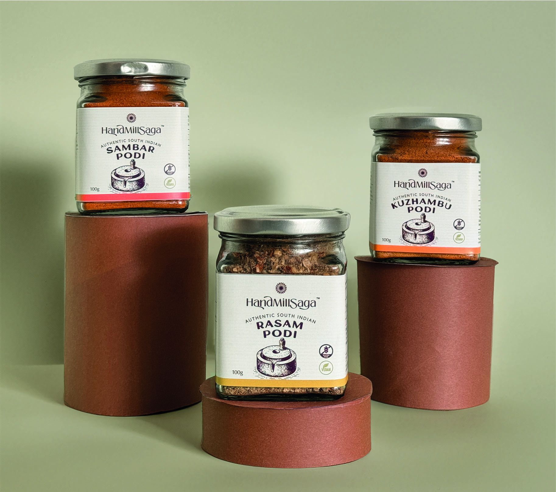
Packaging Symbolism
Our intent was to create an outlook that is both rooted in tradition and modern in
appeal. We incorporated the visual of a traditional hand-ground tool as a symbolic
tribute to South India’s culinary culture.
Our intent was to create an outlook that is both rooted in tradition and modern in
appeal. We incorporated the visual of a traditional hand-ground tool as a symbolic
tribute to South India’s culinary culture.
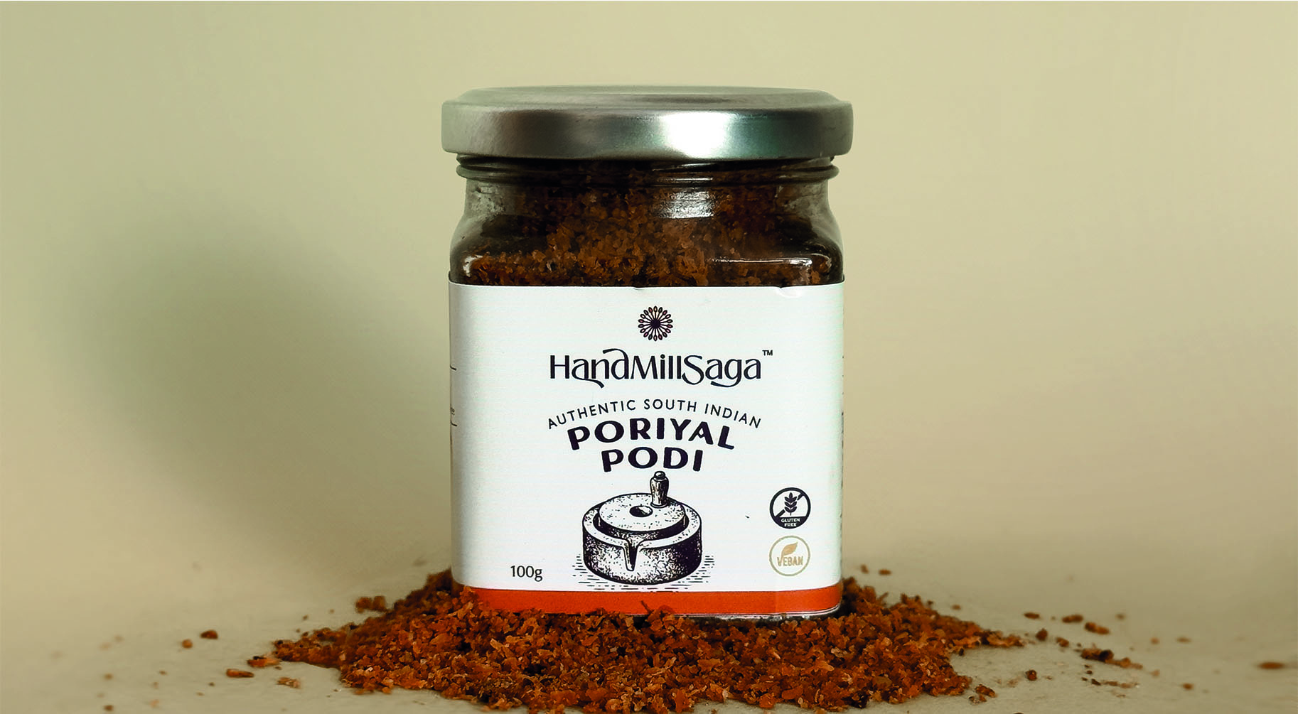
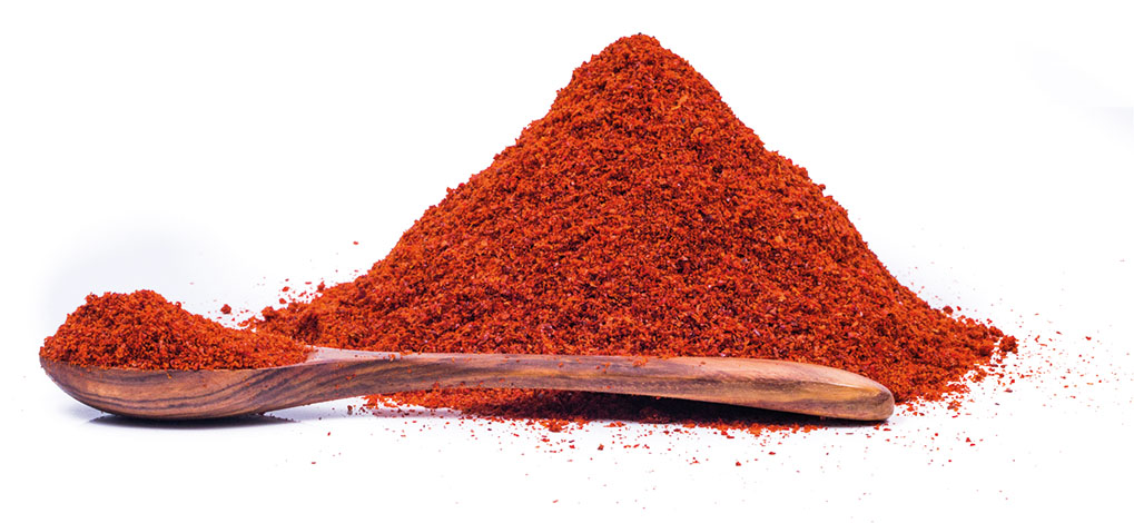
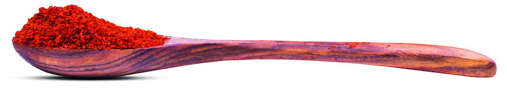
The colours were borrowed from the rich hues of spices and their natural character. Every design element, from the textures to the fonts, has been artistically crafted to honour tradition while resonating with an international audience. Additionally, a colour strip runs across the package to highlight the spice level to aid the customer’s buying decision.
© Copyright 2020 Ivory Spin.